Spotify — The User Experience
A usability case study into the user experience of Spotify's mobile application for Android.

Overview
The goal of this project was to conduct a usability analysis into Spotify's mobile application for Android to assess the effects of usability on user experiences. We also wanted to find out how Spotify maintains its lead as one of the world's most popular audio streaming subscription service despite being in such a highly competitive market.
Role
Project Lead (Group of 4)
Course Assignment (Aug. 2017)
Background
Spotify originally started as two individuals with an idea working overnight in a basement and has since blossomed into one of the most popular music streaming subscription services on the market to date. After years of hard work, Spotify was officially released on the Google Play store on June 2012 (Spotify Press, 2012) for Android devices, offering a free, high quality digital music streaming service with over 30 million songs available on their catalogue.
Spotify offers users two subscription options: Spotify’s free version, which is ad-supported, and Spotify premium, an ad-free, paid subscription service. Regardless of subscription status, Spotify promises to provide its users with the following:
• Free streaming on mobiles or tablets
• Find music, songs, albums and hits from favourite artists
• Create your own playlist
• Stream radio stations worldwide
• Personalised music recommendations
• Spotify connect, allowing for device streaming
In such a highly competitive market with hundreds of music streaming apps to choose from, Spotify has demonstrated a steady growth of premium users over the past two years with research indicating that Spotify’s growth has started outpacing the growth of major competitor, Apple music.
Mission Statement
Understanding the User
Before we conduct our usability analysis, we first needed a better understanding of user behavior and user needs. Questions that we asked ourselves included the following —
• "Who are the users (that use the app)?"
• "Do they share common characteristics? If so, are we able to group them together?"
• "Why are the users using the product and what are their goals and motivation"
• "What needs does Spotify solve (for these users)? How is it able do so?"
After some investigation, we were able to categorise most users into two main groups (‘The Casual User’ & ‘The Premium User’) and we also broke down ‘The Premium User’ into two other subgroups (‘The Student’ & ‘The Everyday Worker’), each with their own set of characteristics and attributes.
The Casual User is constantly on the verge of deciding whether they should subscribe for an ad-free experience, or to put up with the advertisements before going borderline insane. For the moment, the Casual User is willing to tolerate some inconvenience in exchange for a well-designed application that does its job - to stream music in a legal and accessible way.
• Millennials that are 18 to 35 years old
• Mostly high school or university students
• Works part-time / casually
• Decent with technology
• Does not require instructions or user manuals but appreciates tips on how to do things
• Likes to follow playlists
• Enjoys a variety of genres
• Wants to listen to music for free legally without paying or downloading it illegally
• Uses Spotify every odd day off, not enough to warrant a subscription
• Most used feature is ‘Create a Playlist’
• Mostly uses Spotify whilst travelling or during their free time
The Premium User may agree that Spotify Premium has its issues, but is more than satisfied with the decision of subscribing for premium for the full experience. Premium Users are heavy users of the application and use it on a near daily basis, often while transporting from place to place, doing work, and during their free time.
• Millennials that are 18 to 35 years old
• Consists of students, the everyday workers and the unemployed
• Decent with technology, but is not good with anything complex
• Does not require instructions or a user manual
• Pays for Spotify Premium
• Unable to stand advertisements in the free version
• Wants the features that a Premium user enjoys
• Enjoys a variety of genres
• Wants to enjoy music on the go whilst studying, working, and/or travelling
• Uses Spotify frequently enough to warrant a subscription
• Mostly uses Spotify on the commute to work/school, whilst exercising, or doing work
• Uses the ‘Browse’, ‘Back/Forward Songs’ and ‘Create a Playlist’ feature
The Premium User can be further categorised into two other subgroups —
The Student loves the sleek and minimalist style that Spotify offers, along with its simple and easy to understand interface. The Student is always on the lookout for new and rising songs, always checking out the ‘Discover Weekly’ and ‘Top Hits’ albums made by Spotify. The Student are heavy users of the application and use it on a daily basis. They can be often found creating playlists and listening to music while heading to buildings in-between classes, travelling from place to place, while doing their work and during their free time relaxing at home.
• Millennials that are 18 to 35 years old
• Studies at University
• Works part-time / casually
• Does not require instructions or a user manual
• Pays for Spotify Premium
• Likes to keep up to date with the latest music
• Wants to keep track of favourite songs without having to download and sync through a computer
• Enjoys a variety of genres
• Wants to enjoy music on the go whilst studying, travelling and exercising
• Uses Spotify nearly everyday
• Mostly uses Spotify on the commute to school, whilst exercising, doing work, or in their free time
• Uses the ‘Browse’ and ‘Create a Playlist’ feature the most
The Everyday Worker consists of mostly young working adults who want a music-streaming app that is simple, easy to use, and gets the job done. The Everyday Worker are frequent users of the app, using it on a near daily basis, often while on their commute to work, while working on stuff, and during their free time.
• Young adults who are 25 to 35 years old
• Works Full-time
• Decent with technology
• May not require instructions or a user manual, but does appreciate usability tips
• Pays for Spotify Premium
• Wants to keep track of favourite songs without having to download and sync through a computer
• Enjoys a variety of genres
• Wants to enjoy music on the go whilst working and travelling
• Uses Spotify nearly everyday
• Mostly uses Spotify on the commute to work, whilst exercising, doing work, or in their free time
• Uses the ‘Create a Playlist’ feature the most
User Tasks Analysis
After understanding our users, we then went on to identify some of the common tasks that users may complete while using the application.
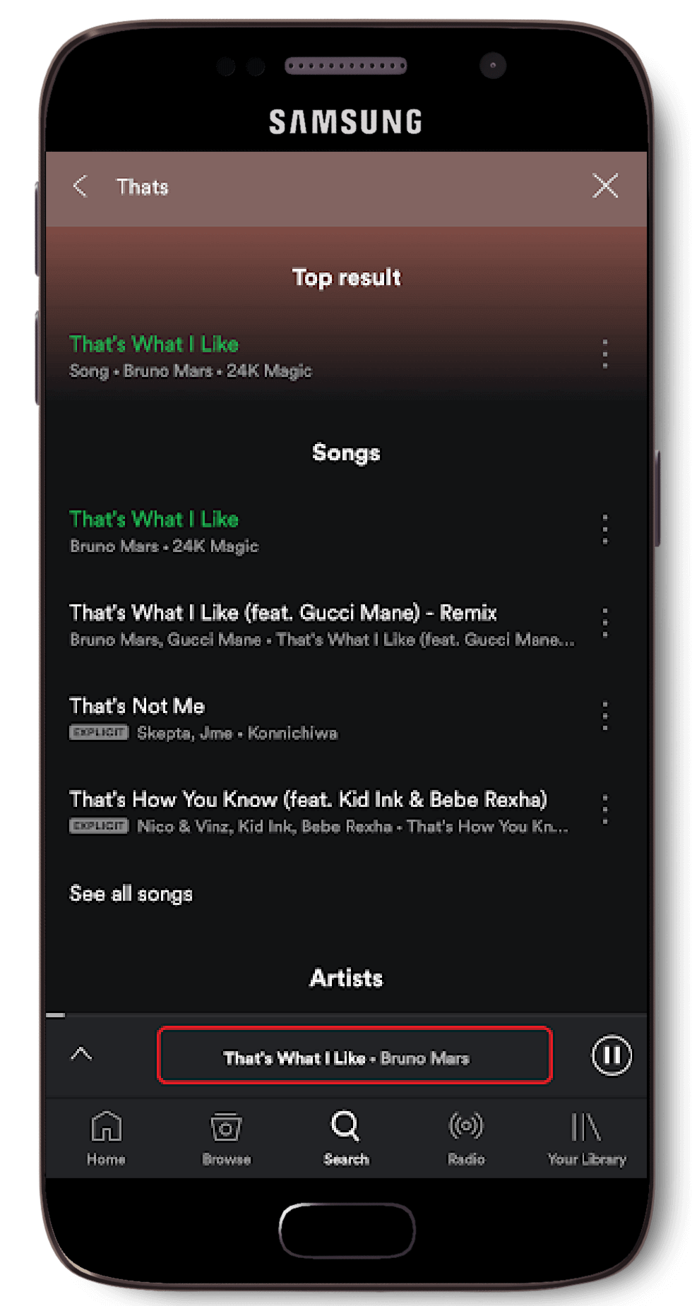
Upon launching Spotify, the user is greeted with the Spotify home screen along with a menu. The search icon can be found in the middle of the menu bar at the bottom of the screen. Searching for a song or an artist(s) is one of the most fundamental and important feature of Spotify. Additionally, searches made are stored in a ‘Recent Searches’ section should the user wish to revisit a search that they made.
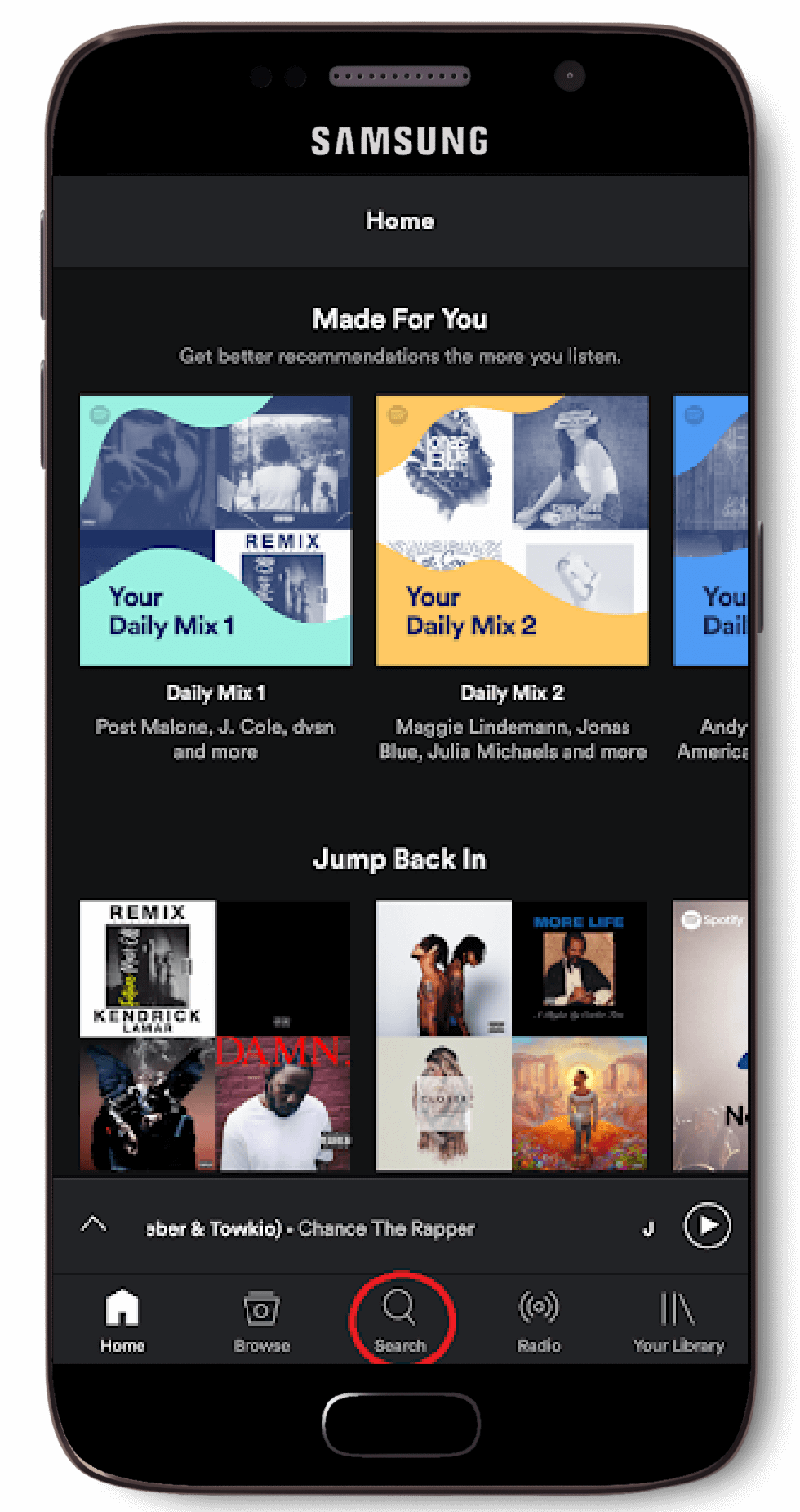
Select ‘Search’
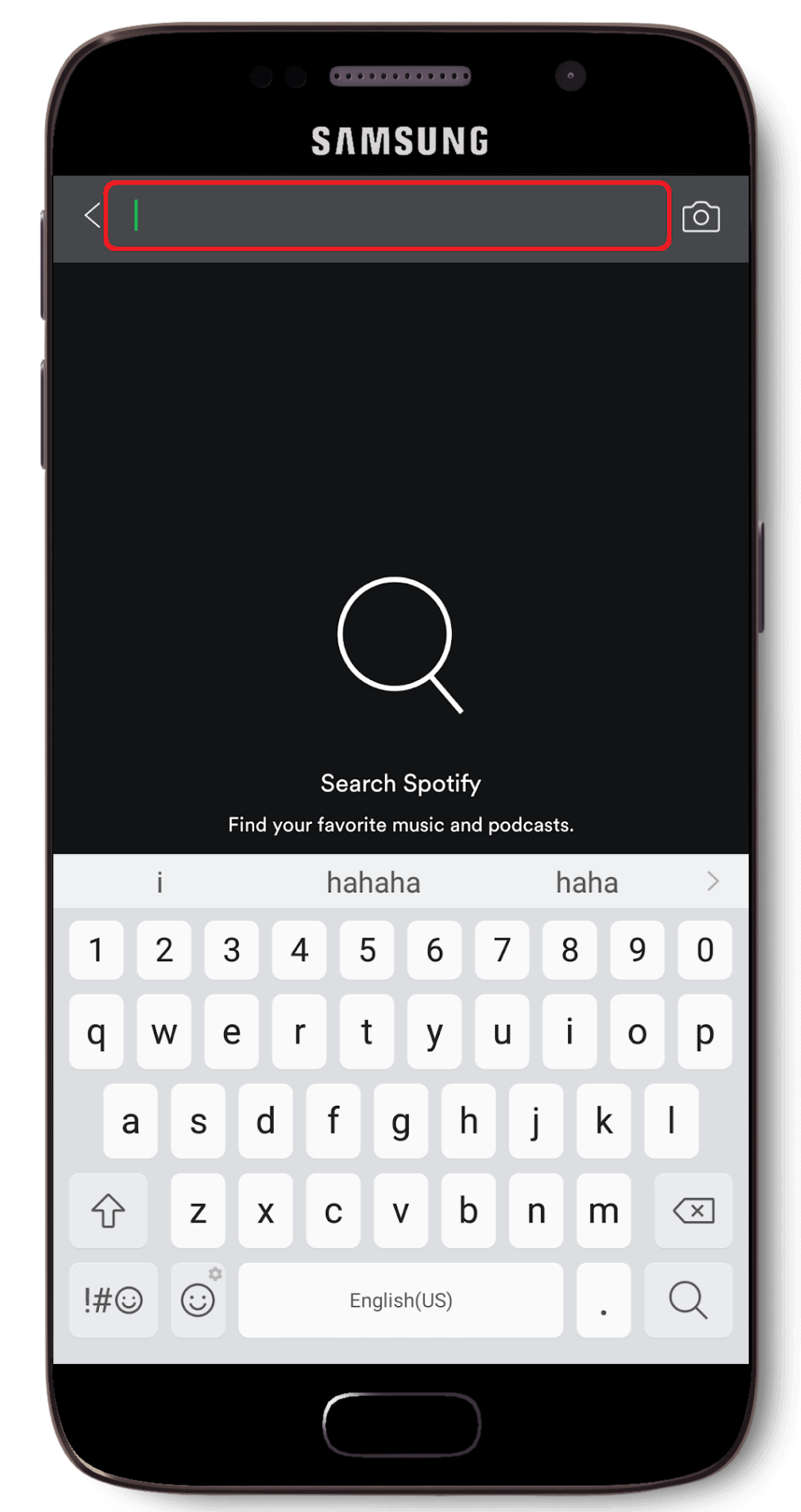
Enter in search phrase
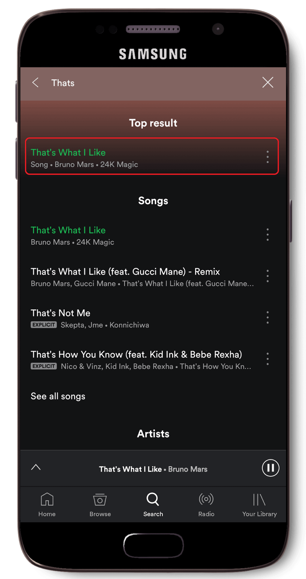
Select desired result
The user also has the ability to create and save a playlist whilst on the ‘saving a song’ menu.
Select the ‘...’ icon
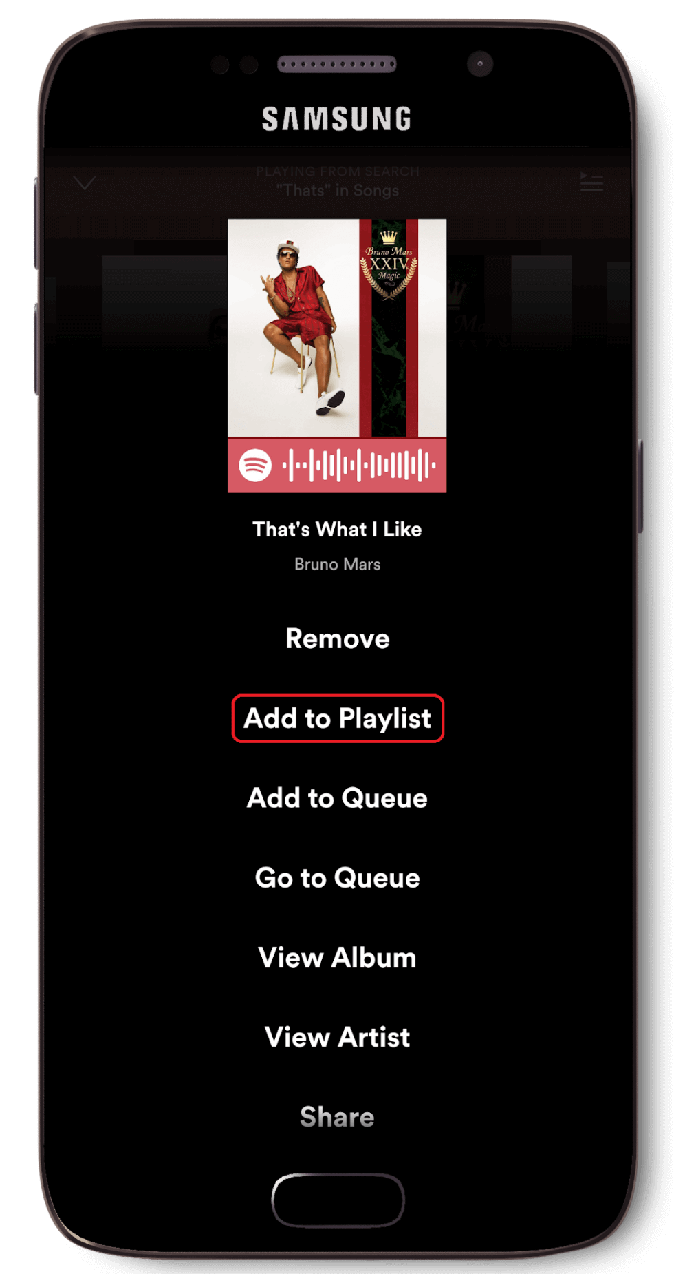
Select ‘Add to Playlist’
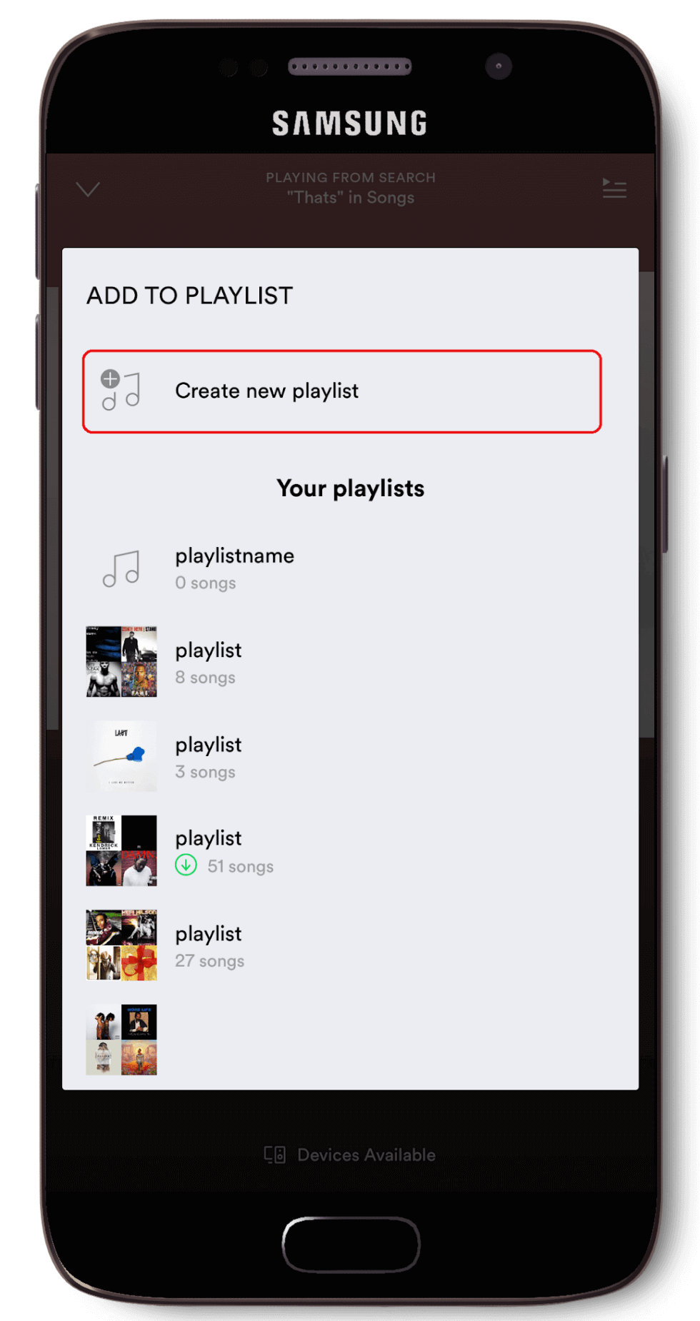
Select ‘Create new playlist’
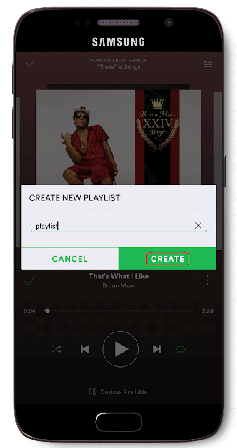
Name the playlist
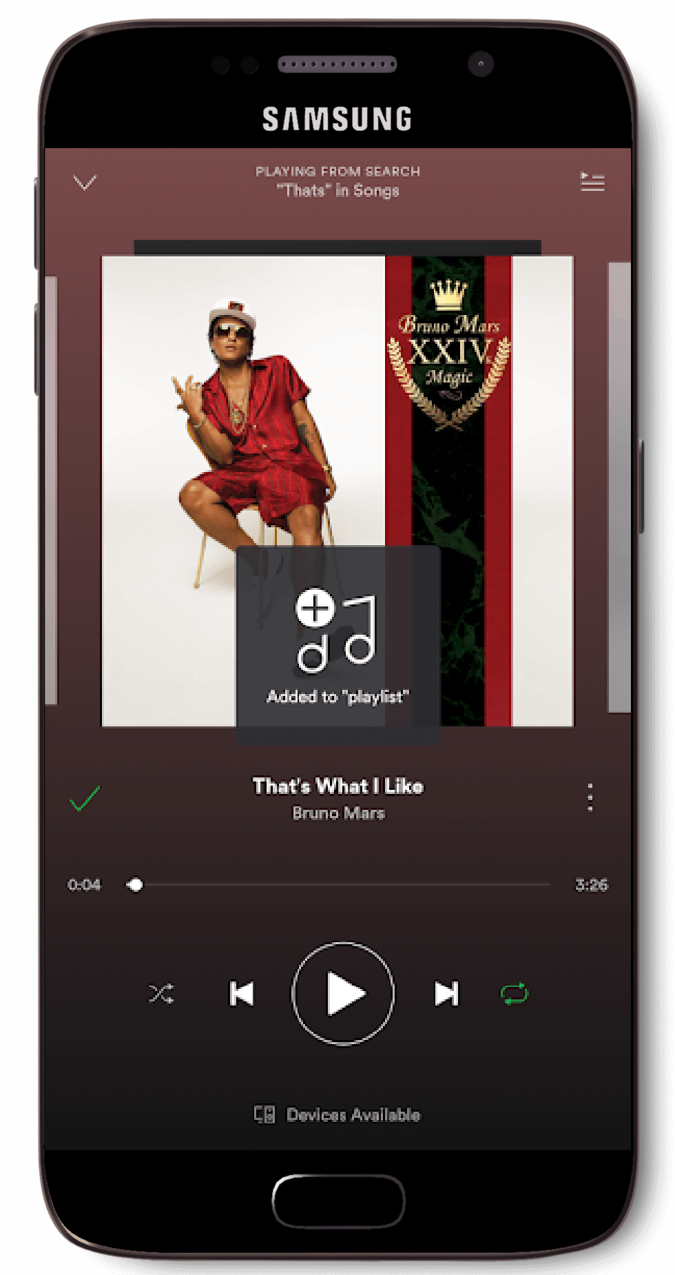
Playlist created!
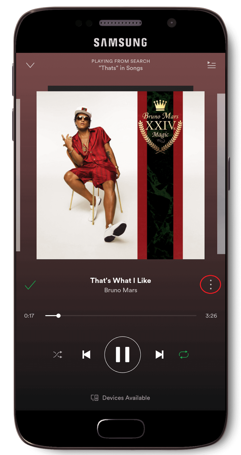
When a user finds that a song that they enjoy, the first thing they would do would be to save that song to their personal library. Spotify has implemented a two tap design to make feature easier for the user to complete.
Click on the song

Press the plus ‘+’ button
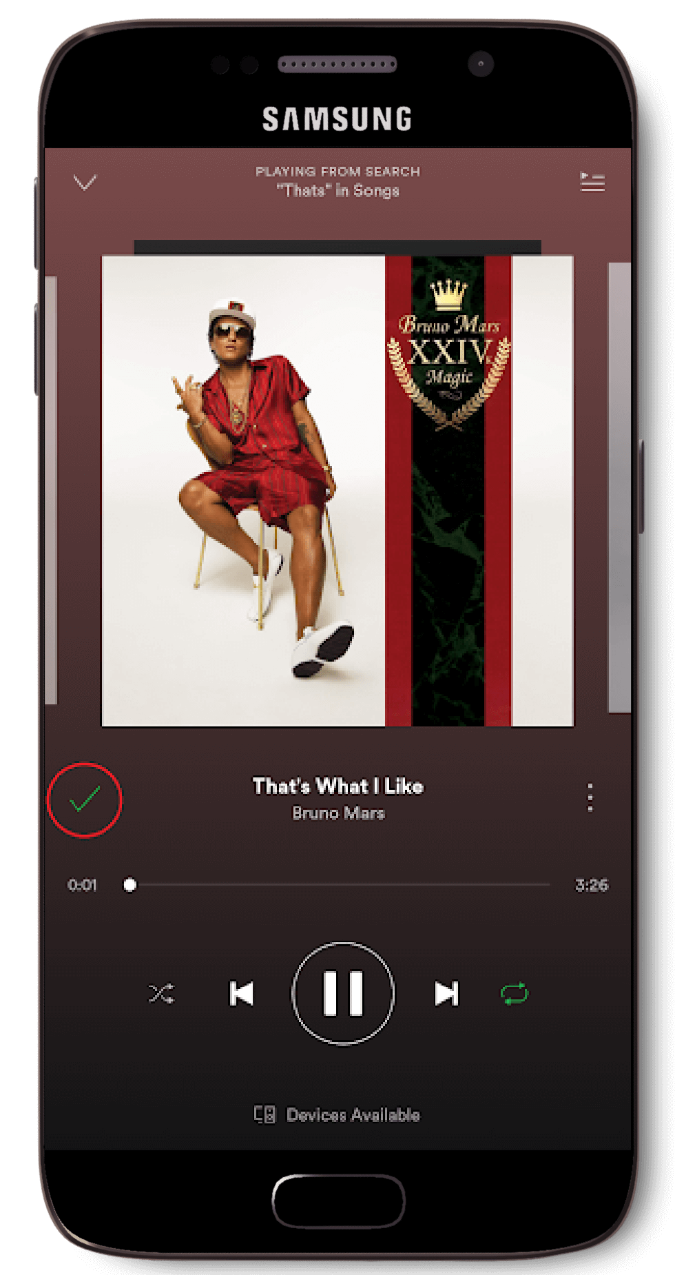
Song is now saved ‘✓ ’
The user can choose to download either their whole song library, certain playlist or even certain songs in a playlist. The downloading process for both playlists and ‘Your Library’ are very similar.
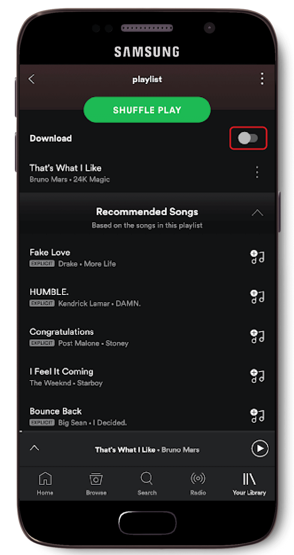
Toggle ‘Download’
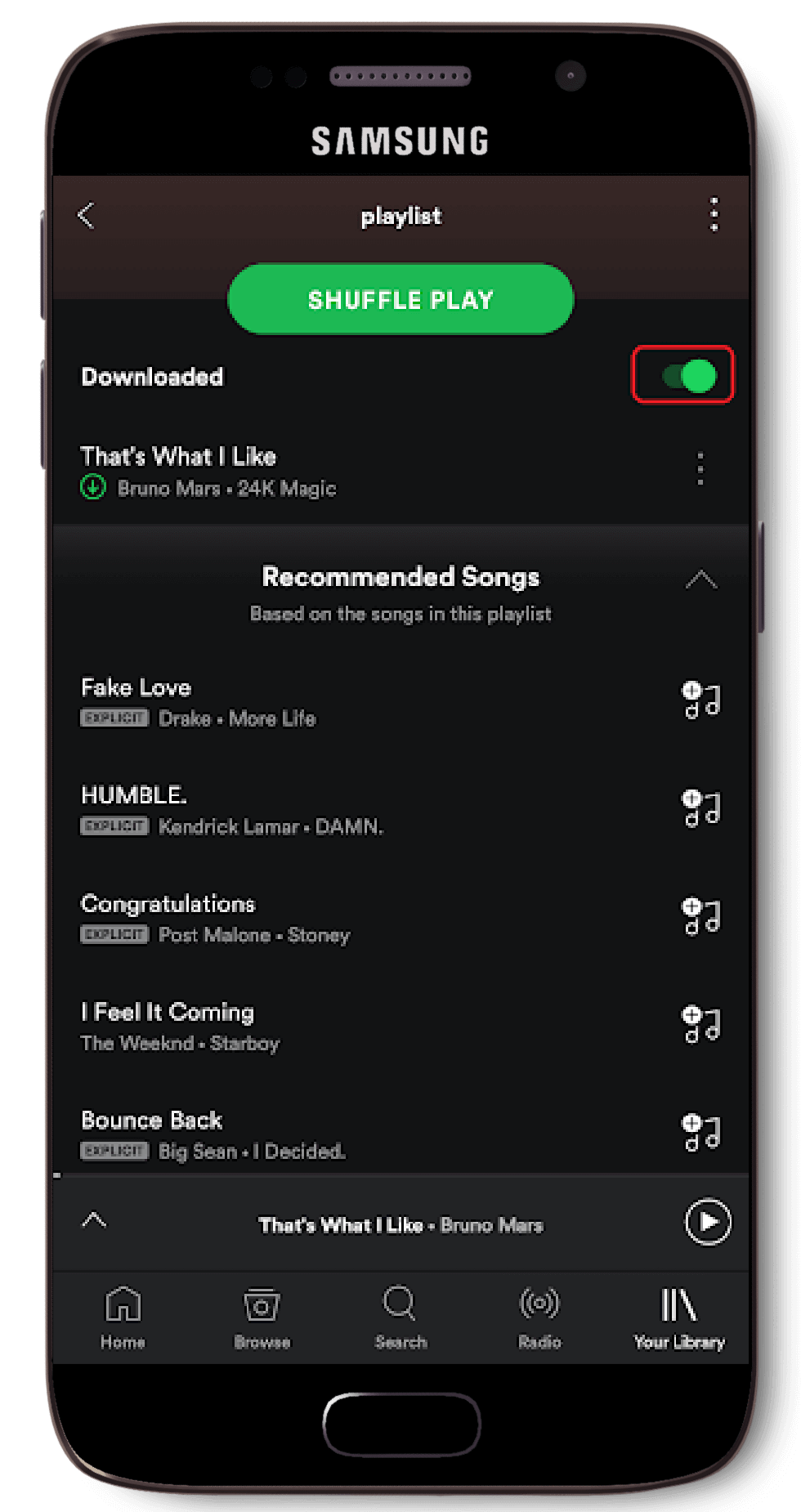
Songs downloaded!
Many free users choose to upgrade to Spotify Premium just so they can listen on the go while offline. This is where Offline Mode comes in handy, as only songs that have been downloaded are available for listening.
These songs are highlighted with a green circle with an arrow pointing downwards next to the below the song titles, right beside the artist details. Whilst non-downloaded songs are greyed out. If a user attempts to play a song that has not been downloaded whilst offline, a little pop-up bubble will trigger telling the user that ‘This song is not available’.
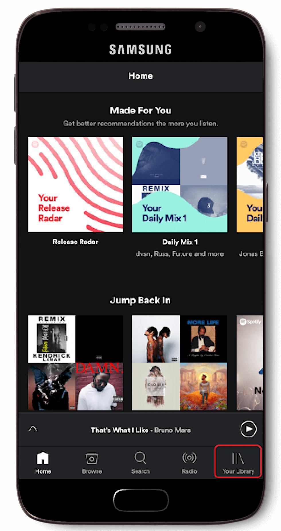
Go to ‘Your Library’
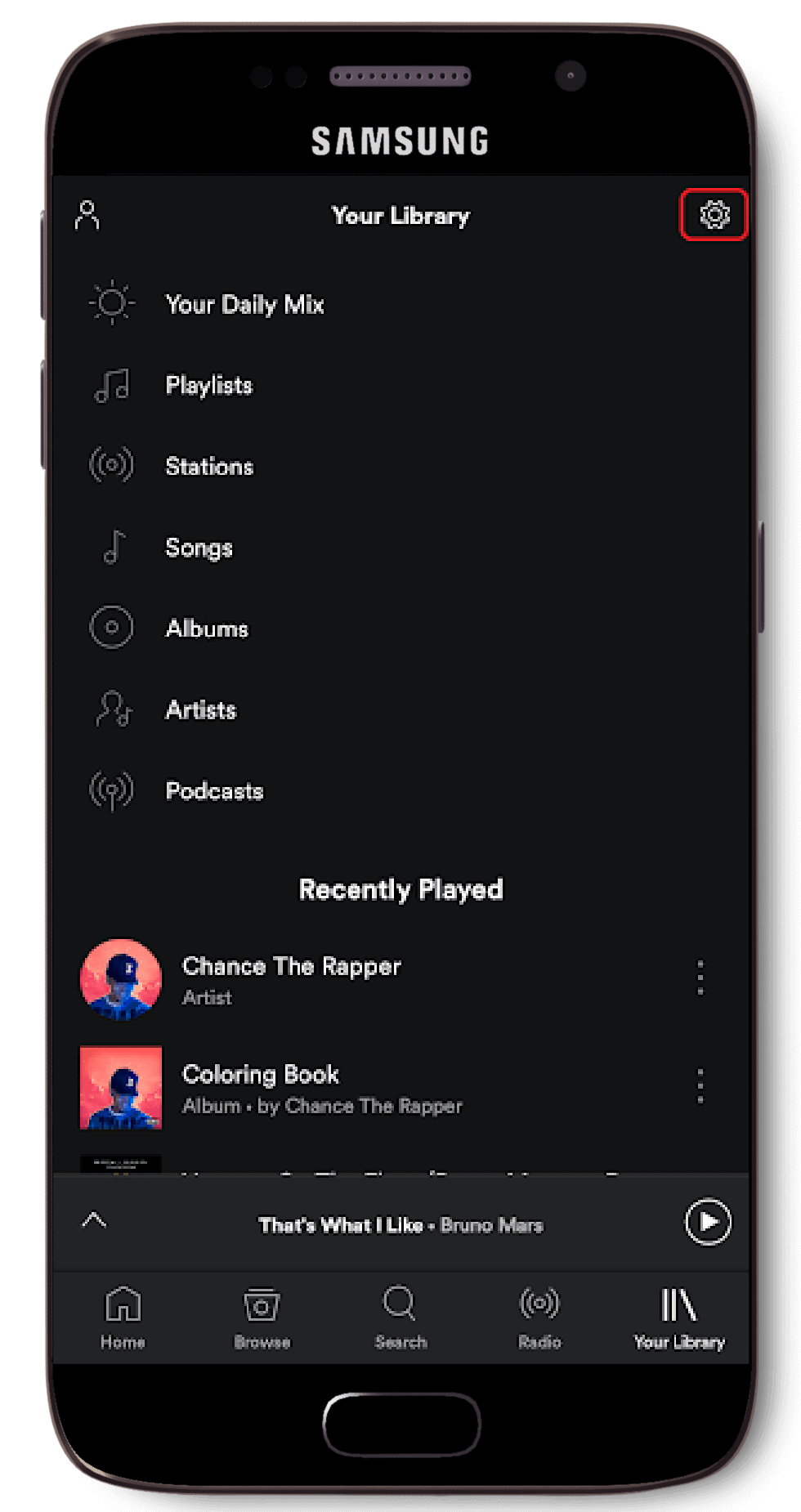
Go to ‘Settings’
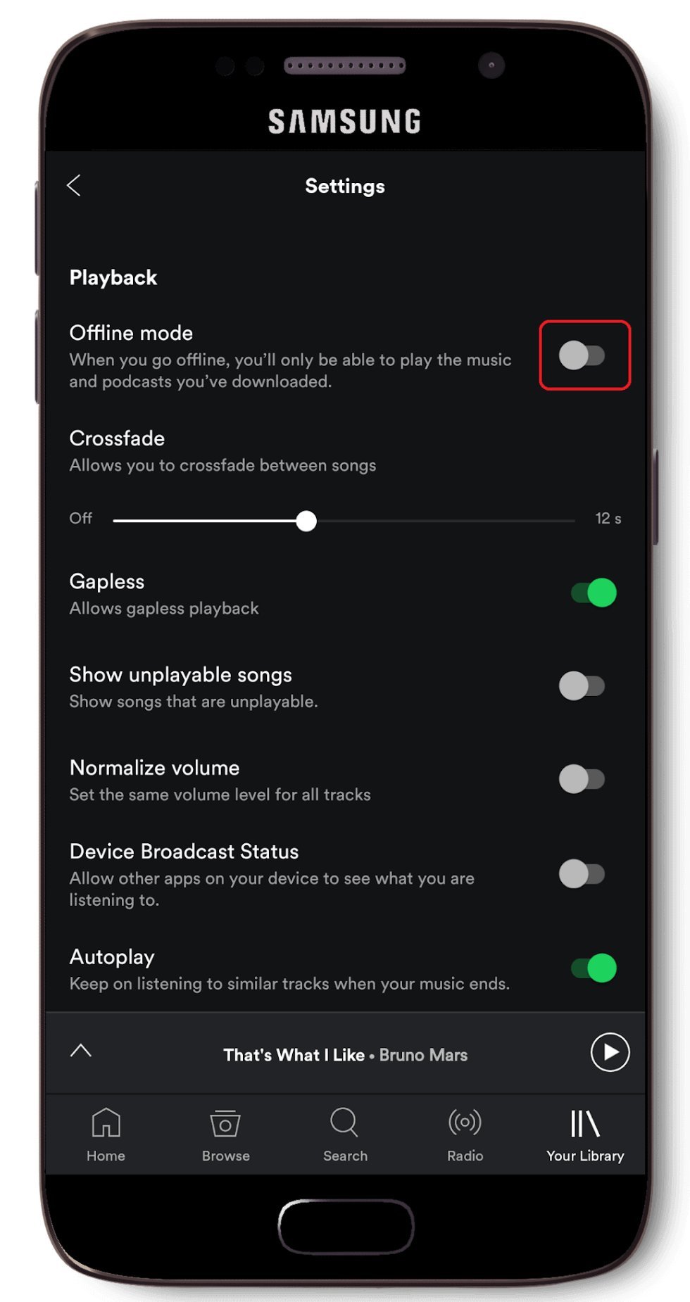
Enable ‘Offline Mode’
Heuristic Analysis
We then examined Spotify's interface based on Jakob Nielson's 10 usability heuristics for User Interface Design. Each heuristic is rated by a music note ‘♪’ from 0 to 4 to signify the significance of its severity rating.
Severity Rating —
0 ( - - - - ) — Don’t agree that this is a usability problem
1 ( ♪ - - - ) — Cosmetic problem
2 ( ♪ ♪ - - ) — Minor usability problem; low priority to fix
3 ( ♪ ♪ ♪ - ) — Major usability problem; important to fix, task should be high priority
4 ( ♪ ♪ ♪ ♪ ) — Usability catastrophe; imperative to fix
Spotify on Android does a great job on keeping the user notified on the progress of the user’s current task. It has features such as a showing a notification bar that shows completion progress whilst downloading playlists, percentage statuses, and a ‘Downloaded’ icon next to songs that has been successfully downloaded along with pop-up notifications indicating when certain tasks are done.
Spotify mostly relies on having their menu icons to tell the users on how to navigate their application. Using simple and straightforward icons makes the experience smooth and easy. An example of this would be the home icon, which is represented by a minimalist house design, and when pressed, it will bring the user back to the ‘Home’ menu. Another example would be the magnifying glass icon, which is used to represent the ‘Search’ menu.
Most android smartphones have a built in back button feature by default that can be used in all applications. In addition to that, Spotify themselves has made an in-app back button that appears on the top left hand corner of each page visited. The navigation bar is also permanently planted in the app, so no matter where the user is on the app, users are never more than a tap away from the ‘Home’ screen.
Spotify has a very distinct and consistent design that focuses on using easily recognisable symbols instead of words or labels to keep the application simple and usable. The Pause / Play button is one of the main aspect of this and is shown above the main menu bar on the right side (once a song has been played upon launching the app). The button will then remain until the user either goes into the main ‘Song’ menu where the Pause/Play button is enlarged and shifted to the centre at the bottom, or when the user closes the application.
Spotify has implemented some features to make their application less error prone. For example, if a user attempted to delete their own playlist, a dialogue box will pop-up asking the user for confirmation before proceeding with the deletion of the playlist.
However, there is also a lack of error prevention. When a user attempts to unfollow a song in their library, or unfollow a playlist, only a pop-up dialogue is shown telling the user that ‘...’ song was “Removed from Your Library” or “You’ve stopped following” ‘...’ playlist without confirmation, the user has to then navigate back to ‘...’ song or playlist and save/follow to get it back again.
Spotify’s experience is almost identical across all mobile platforms. Spotify uses large visible icons along with labels for the menu bar located at the bottom of the screen. They also adapted the same details for other specific items such as ‘Genres & Moods’. Instead of adapting a purely icons or labels style, they make use of both for easier recognition.
For example, a magnifying glass represents the ‘Search’ icon. This was done as people intuitively relate the magnifying glass as an icon that is used to look for something.
Spotify’s overall design and interface enables users to complete tasks efficiently - If a user wanted to share a particular song that they love, all they have to do is expand the song menu and tap on ‘Share’.
Spotify also has a fixed menu bar that provides an easy way to navigate within the app itself. However, users are unable to customise this menu bar and remove or change lesser-used icons with other menus that are more frequently used. (For example, users that do not use the ‘Radio’ feature may want to replace it with something else, such as a ‘Now Trending’ icon, but are unable to do so)
Aesthetically speaking, Spotify is well designed. Being very similar to Apple's interface, the pioneer of design, its minimalistic approach makes for an eye-catching display for the users to enjoy and easily get used to. Spotify has strictly followed this guideline of minimalism by ensuring that it only offers what is required in order for the user to complete the desired task.
User are presented with a simple menu on the bottom of the screen with five menu options, most of which are the main features that Spotify offer and brings about ease of navigation.
Spotify’s colour scheme of contrasting green and black, and images make it visually pleasing when using the app.
Spotify does an excellent job in helping users recognise their errors with clear error message and visual feedback when an action has been done. However, the message can sometimes be too vague. If a user were to accidentally remove a song from their library, the message displayed would just show ‘Removed from Your Library’, and fails to mention details of the song that was removed.
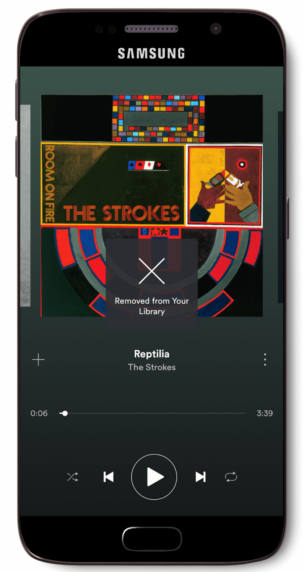
Overly vague error message
Spotify was designed in such a way that it kept its users in mind and achieving a task is simple and straightforward. But, while it was designed to be simple and straightforward, the app itself does not offer simple instructions like a manual or tutorial.
Additionally, Spotify did not taken into to consideration for ALL of its users - For example, millennials may be tech savvy and are unlikely to require assistance navigating the app, but what about someone older, or someone who are not familiar with technology? This is likely to frustrate both casual and premium users alike who are not tech savvy that are looking for basic guidance to the app.
Furthermore, while Spotify does have an online Support forum, the ‘Support’ option to get to it is well hidden away at the very bottom in the ‘Settings’ menu inside the application.
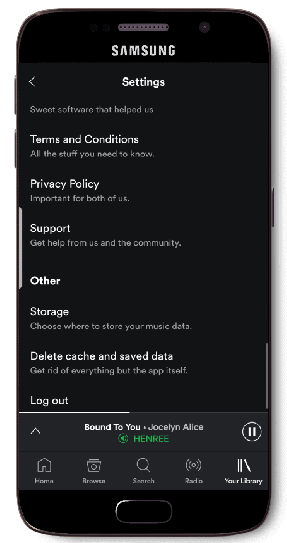
Hidden away ‘Support’ section
User Research
A survey was conducted into 40 participants to gather their thoughts and views in relation to their user experience with Spotify's android application. Our findings from the survey are as follows:
While Spotify has over 60 million active subscribers which accounts for over 40% of their user base. Our survey results found that that out of the 40 people who participated, 78% of them were Spotify Premium subscribers. This result is a good indication that Spotify is able to achieve its primary goal of bringing about music to its users in a free and accessible way. With that said - users are so pleased with the app that most of the surveyed users are willing to pay a monthly subscription to support and get the full Spotify experience.
One thing that we identified from the survey results was the ‘Settings’ menu was not obvious for some users - in fact it took users several attempts of looking through each menu before they found the settings. Our survey found that 87% of the users were able to find the settings menu within a couple of taps, while the 13% had trouble locating it.
In addition, the ‘Support’ option is located within the settings and since users are already struggling to find the settings, they are highly unlikely to find the ‘Support’ option under the settings. This goes against Nielsen’s principle of ‘Help and Documentation’, where information should be easily accessible when sought.
Furthermore, it also goes against Steve Krug’s law of ‘Don’t Make Me Think’ where Krug explains that – “as a rule, people do not like to puzzle over how to do things”. Having to look through each of the menu options just to find the settings, causes the user to think about where they have to look in order to find the documentations that they are looking for.
While Spotify remains one of the more popular music streaming applications out there. Our survey results found that while 90% of the surveyed users are using Spotify on a near daily basis, more than 50% of the users surveyed reported that they had additional streaming apps installed on their devices.
Results revealed that the most common reason as to why users opt for alternatives streaming apps were largely due to the selection of music and ease of use. Spotify is unable to cater to small/underrated artists/musicians due to the competitive nature of the music industry, causing them to lose a minor portion of paying users who find no incentive to commit to a Premium subscription. Additionally, other music streaming apps also offer users the ability to customise menus & bars, allowing the user to easily transition over customise the app and call the app ‘theirs’.
A standard feature ensures that the users can understand the interface elements in the design and they know where to look for what features (Jakob Nielsen, 1999). Spotify has ensured that it followed platform and industry standards by designing their app in such a way that the users are able to understand what icons and labels represent and how they are supposed to operate the application without having to do much thinking.
Spotify’s approach to the menu bar also aligns with Steve Krug’s law of usability - ‘Don’t make me think’. We tested this idea in our survey by removing labels from icons located in the menu bar and having users to identify what each of the icon represented, and we found that the overall success rate for most icons was well over 90%, with the lowest being 70% for the ‘Browse’ icon, indicating that Spotify has managed to implement a well-designed navigation scheme while keeping in mind the user’s mental model.
Furthermore, Spotify’s implementation of a simple menu with minimalistic icons to represent the some of its key feature along with shortcuts to navigating the app worked well, this is also reflective of the survey results where over 72% of the surveyed users found the app easy to navigate and 82% of them found the app to be well designed. Additionally, a surveyed user responded that the big plus button located beside songs helped when they were asked the question ‘Was it easy to download or save a song / playlist?’ This further supports the idea that minimalistic icons used in conjunction with labels helped in the identification of icons, resulting in a more fluid user experience.
Conclusion
Spotify is able to offer its users a unique experience by successfully providing them with a high quality music streaming application that is minimalistic, attractive and usable. Spotify manages to adheres to majority of Nielsen’s principles and Steve Krug’s laws of usability and though there were some minor flaws, it did not affect the user experience in a disruptive manner.
Spotify has ultimately managed to create a design that is not only simplistic, but one that has their users pleased and satisfied with, providing for a great user experience. This is further reinforced by the survey results, with majority of the survey participants leaving positive feedback with regards to Spotify’s interface design and its features.